Create a logo

  • Status: Closed
  • Prize: £50
  • Entries Received: 290
  • Winner: rehannageen

Contest Brief

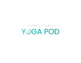
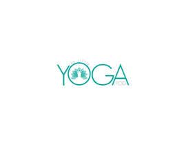
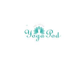
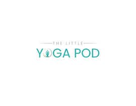
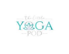
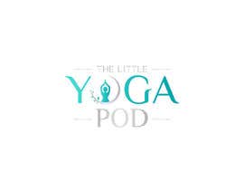
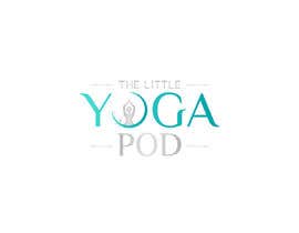
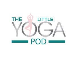
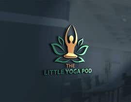
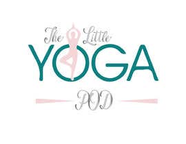
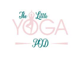
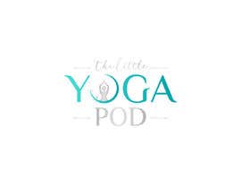
I would like a logo for my new yoga business ‘The Little Yoga Pod’ which is a small, intimate yoga space.
I would like it to cover the following:

- "The Little" to be presented before and slightly smaller than "Yoga Pod"
- Colour scheme is not set but i would like it to include some Teal
- Ideas for images to inclue are; sitting meditation, soft circles, lotus flower

Many thanks in advance xx

Recommended Skills

Employer Feedback

“Nageen was very patient with me being indecisive about my design, had excellent communiction and came back with alterations very quickly. Would definately hire again. ”

Profile image Gemmaluke, United Kingdom.

Top entries from this contest

View More Entries

Public Clarification Board

  • sabihayeasmin218
    sabihayeasmin218
    • 4 years ago

    Please check the logo Dear CH. The contest time was that I uploaded the logo on this site. https://prnt.sc/plvhwu

    • 4 years ago
  • sabihayeasmin218
    sabihayeasmin218
    • 4 years ago

    Please check the logo Dear CH. The contest time was that I uploaded the logo on this site. https://prnt.sc/plvhwu

    • 4 years ago
  • shamirayusoff
    shamirayusoff
    • 4 years ago

    Hi please check. I hope you will like it Sir.

    • 4 years ago
  • darshna19
    darshna19
    • 4 years ago

    Please check #404 #405

    • 4 years ago
  • vartman12
    vartman12
    • 4 years ago

    hi ....please tell about latest changes

    • 4 years ago
  • poojayadav879119
    poojayadav879119
    • 4 years ago

    Hi, kindly check #360 thank you

    • 4 years ago
  • gdpixeles
    gdpixeles
    • 4 years ago

    please check my entry #351

    • 4 years ago
  • gdpixeles
    gdpixeles
    • 4 years ago

    please check my entry #166

    • 4 years ago
    1. Gemmaluke
      Contest Holder
      • 4 years ago

      Hi
      I really like this one. Thank you. Feels like you have really listened to what I’m after in terms of text sizing and colour.

      • 4 years ago
    2. gdpixeles
      gdpixeles
      • 4 years ago

      thank you

      • 4 years ago
  • morsalin0171
    morsalin0171
    • 4 years ago

    please check #266 #267 #268

    • 4 years ago
  • vartman12
    vartman12
    • 4 years ago

    thanks for this message ...yes i work on it.

    • 4 years ago
  • darshna19
    darshna19
    • 4 years ago

    Please check my entries #257 #256

    • 4 years ago
  • DeFurqan
    DeFurqan
    • 4 years ago

    Hy any changes in my logo firve you gave 5 stars now 4 ??

    • 4 years ago
    1. Gemmaluke
      Contest Holder
      • 4 years ago

      Hi,
      No I’m sorry. I do still really like it and it was by far my favourite but as I am seeing more come through there are a few I like equally now. Please no offence. It is very good

      • 4 years ago
    2. DeFurqan
      DeFurqan
      • 4 years ago

      okay if you will give me award then i will all make changes according you. like color or text etc.. you want. thankyou!

      • 4 years ago
  • sujon100sokhi
    sujon100sokhi
    • 4 years ago

    check #189

    • 4 years ago
  • atiachowdhury88
    atiachowdhury88
    • 4 years ago

    please check #170 #171 #172 #173 #176 #178 #180 #181

    • 4 years ago
  • abuyusufmasbah1
    abuyusufmasbah1
    • 4 years ago

    #175

    • 4 years ago
  • Desinermohammod
    Desinermohammod
    • 4 years ago

    Please check #142

    • 4 years ago
  • RafiDesignBD
    RafiDesignBD
    • 4 years ago

    Please check out my entry #137

    • 4 years ago
  • sujon100sokhi
    sujon100sokhi
    • 4 years ago

    hope you like this desing #136

    • 4 years ago
  • Gemmaluke
    Contest Holder
    • 4 years ago

    Hi
    Lots of people are emphasising ‘the little’ as large text and ‘yoga pod’ as small text.
    The logo will need to be either the other way around (‘the little’ small and ‘yoga pod’ big), or the same size.
    Thanks

    • 4 years ago
  • PPROMISE91
    PPROMISE91
    • 4 years ago

    Please Check #122

    • 4 years ago
  • abuyusufmasbah1
    abuyusufmasbah1
    • 4 years ago

    #97 #101 #104 please check

    • 4 years ago
  • morsalin0171
    morsalin0171
    • 4 years ago

    Please check #90

    • 4 years ago
  • vartman12
    vartman12
    • 4 years ago

    #72 have a look and give me direction please

    • 4 years ago
    1. Gemmaluke
      Contest Holder
      • 4 years ago

      Hi
      Thanks for coming back
      Really liking it - can we try a smaller and more subtle image over the text (like the font) and is it possible to loose the dot over the ‘g’
      Also, colour wise I’d really like some turquoise included
      Many thanks

      • 4 years ago
  • morsalin0171
    morsalin0171
    • 4 years ago

    Please Check #75

    • 4 years ago
  • PPROMISE91
    PPROMISE91
    • 4 years ago

    Please Check #45

    • 4 years ago
    1. Gemmaluke
      Contest Holder
      • 4 years ago

      Hi
      A really nice design, just not quite what I’m looking for.

      • 4 years ago
  • sujon100sokhi
    sujon100sokhi
    • 4 years ago

    please check #32

    • 4 years ago
  • gdpixeles
    gdpixeles
    • 4 years ago

    please check my entry #7

    • 4 years ago
    1. Gemmaluke
      Contest Holder
      • 4 years ago

      Thank you for your entry, but not quite what im looking for

      • 4 years ago
  • vartman12
    vartman12
    • 4 years ago

    thanks for response

    • 4 years ago
    1. Gemmaluke
      Contest Holder
      • 4 years ago

      Hi
      I really like the writing but prefer a different image

      • 4 years ago

Show more comments

How to get started with contests

  • Post your contest

    Post Your Contest Quick and easy

  • Get tons of entries

    Get Tons of Entries From around the world

  • Award the best entry

    Award the best entry Download the files - Easy!

Post a Contest Now or Join us Today!