Design a Logo

  • Status: Closed
  • Prize: $44
  • Entries Received: 106
  • Winner: akashbairagi

Contest Brief

Please read all instructions before posting your design.

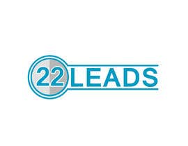
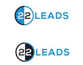
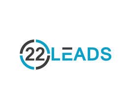
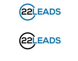
Goal: Design a logo for 22leads.com. We are looking for a simple, clean logo that is a combination of logo & text. The logo needs to stand alone. Possibly the "22" part is the logo and the "leads" part is the text. ".com" should not be part of the logo. Some guidelines
-No clipart
-No gradients
-Show the logo on a white background.
For winning design we will need vector, PNG and a scaled down version of the logo for a favicon for the webpage.
-Keep an eye on public comments, as designs come in I will add more details of as needed to clarify design objectives.

Recommended Skills

Employer Feedback

“Excellent artist, very talented. However the communication was very poor. I had to explain simple things over and over. It took a huge amount of time in revisions since he simply did not understand. It made extra work for me. ”

Profile image tritum, United States.

Top entries from this contest

View More Entries

Public Clarification Board

  • Kellys22
    Kellys22
    • 5 years ago

    please check#392

    • 5 years ago
  • Kellys22
    Kellys22
    • 5 years ago

    please check#388

    • 5 years ago
  • shila34171
    shila34171
    • 5 years ago

    Please also check Modify version #386 #387

    • 5 years ago
  • tritum
    Contest Holder
    • 5 years ago

    Designs are getting close, look at the top rated ones for direction.

    • 5 years ago
  • Kellys22
    Kellys22
    • 5 years ago

    please check #382

    • 5 years ago
  • Kellys22
    Kellys22
    • 5 years ago

    please check#381

    • 5 years ago
  • shila34171
    shila34171
    • 5 years ago

    Please Check my Entry #380

    • 5 years ago
  • shila34171
    shila34171
    • 5 years ago

    Please Check my Entry #378

    • 5 years ago
  • Pitafi
    Pitafi
    • 5 years ago

    Please check my entries #352 #353 #354 #355

    • 5 years ago
  • arianrimon
    arianrimon
    • 5 years ago

    check#341

    • 5 years ago
  • designhunter007
    designhunter007
    • 5 years ago

    please check #336 #337 #338 #339 #340

    • 5 years ago
  • agarzaro710
    agarzaro710
    • 5 years ago

    Hello, if you may review entry #335. Regards.

    • 5 years ago
  • stanbaker
    stanbaker
    • 5 years ago

    Please review my submission #317. Thank you.

    • 5 years ago
  • sufiasiraj
    sufiasiraj
    • 5 years ago

    please check #313

    • 5 years ago
  • sufiasiraj
    sufiasiraj
    • 5 years ago

    please check

    • 5 years ago
  • Rinabairagi
    Rinabairagi
    • 5 years ago

    Please check my entry #312 . Thank you.

    • 5 years ago
  • sufiasiraj
    sufiasiraj
    • 5 years ago

    please check #309 #310

    • 5 years ago
  • graphichouse1
    graphichouse1
    • 5 years ago

    Kindly check #297

    • 5 years ago
  • sufiasiraj
    sufiasiraj
    • 5 years ago

    please check #292

    • 5 years ago
  • Rinabairagi
    Rinabairagi
    • 5 years ago

    Please check my entry #282 . #283 . Thank you.

    • 5 years ago
  • tritum
    Contest Holder
    • 5 years ago

    Everyone: I like the "22" in a simple circle. The challenge is how to connect the Leads part to the rest of the logo. The winner will have a simple solution. Example: no one has tried lowercase letters. Keep the "22" in a circle, open or closed. focus on the Leads part

    • 5 years ago
    1. M1Mask
      M1Mask
      • 5 years ago

      Please check #268

      • 5 years ago
  • Rinabairagi
    Rinabairagi
    • 5 years ago

    Please check my entry #267 . Thank you.

    • 5 years ago
  • Rinabairagi
    Rinabairagi
    • 5 years ago

    Please check my entry #261 . #262 . Thank you.

    • 5 years ago
  • kabir24mk
    kabir24mk
    • 5 years ago

    #257

    • 5 years ago
  • babicpredrag
    babicpredrag
    • 5 years ago

    Please check Entry #233 (simple and clean logo). Thanks.

    • 5 years ago
  • tritum
    Contest Holder
    • 5 years ago

    Everyone is putting circle around 22, try something underneath only, like amazon arrow concept but don't copy the arrow. Be creative

    • 5 years ago
    1. M1Mask
      M1Mask
      • 5 years ago

      please check #216

      • 5 years ago
    2. M1Mask
      M1Mask
      • 5 years ago

      #224

      • 5 years ago
  • M1Mask
    M1Mask
    • 5 years ago

    please check #216

    • 5 years ago
  • marazulsss
    marazulsss
    • 5 years ago

    #210 #211

    • 5 years ago
  • marazulsss
    marazulsss
    • 5 years ago

    #210 #211

    • 5 years ago
  • marazulsss
    marazulsss
    • 5 years ago

    #208 #209

    • 5 years ago
  • graphichouse1
    graphichouse1
    • 5 years ago

    Kindly check #197, #198, #199, #200, #202, #203

    • 5 years ago
  • Rinabairagi
    Rinabairagi
    • 5 years ago

    Please check my entry #85. #186. #187.

    • 5 years ago
  • tritum
    Contest Holder
    • 5 years ago

    Simple fonts. No script or hard to read. Also why is everyone using Circle? Be original.

    • 5 years ago
    1. HasibHossen
      HasibHossen
      • 5 years ago

      Hi there, please tell about your business.

      • 5 years ago
    2. M1Mask
      M1Mask
      • 5 years ago

      please check #159

      • 5 years ago
  • tritum
    Contest Holder
    • 5 years ago

    Stay away from cluttering the font. clean/clear text works better. So far i like the "22L" as the graphic part of the logo with "eads" being text. Focus on the intersection in your designs where "22L" combines with "eads". Try variations based on that. With this approach, I can use 22L as a logo without text when needed
    ""

    • 5 years ago
  • M1Mask
    M1Mask
    • 5 years ago

    #136

    • 5 years ago
  • tritum
    Contest Holder
    • 5 years ago

    Please read description. (1) Don't put ".com" in logo (2) White backgrounds only. Deleting designs that don't follow instructions.

    • 5 years ago
    1. M1Mask
      M1Mask
      • 5 years ago

      #126

      • 5 years ago
    2. M1Mask
      M1Mask
      • 5 years ago

      #127

      • 5 years ago
  • sufiasiraj
    sufiasiraj
    • 5 years ago

    please check #119 #120 #121

    • 5 years ago
  • tritum
    Contest Holder
    • 5 years ago

    Colors: Focus on Blue/Black on white background.

    • 5 years ago
    1. sixgraphix
      sixgraphix
      • 5 years ago

      #77, #79, #80

      • 5 years ago
  • tritum
    Contest Holder
    • 5 years ago

    FYI: rejecting all designs that are not on white background. Read directions. Thanks

    • 5 years ago
  • tritum
    Contest Holder
    • 5 years ago

    Do not add any border around design

    • 5 years ago
    1. M1Mask
      M1Mask
      • 5 years ago

      please check #68

      • 5 years ago
  • tritum
    Contest Holder
    • 5 years ago

    Logo should be horizontal. Logo, then text. Not logo over text

    • 5 years ago

Show more comments

How to get started with contests

  • Post your contest

    Post Your Contest Quick and easy

  • Get tons of entries

    Get Tons of Entries From around the world

  • Award the best entry

    Award the best entry Download the files - Easy!

Post a Contest Now or Join us Today!