Design a Logo
- Status: Closed
- Prize: $200
- Entries Received: 28
- Winner: BlueEyes1

Contest Brief
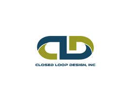
Closed Loop Design, Inc. (CLD)
We do electronic and scientific equipment design. Some specific example areas: signal processing, software-defined radio, FPGA design. “Closed Loop” refers to a control-theory concept, where feedback is used to adjust the outputs of a system. I think this applies to business practices as well.
The logo should reflect the meaning of “Closed Loop”, thus indicate some sort of closing or closed loop geometric form. My initial idea was to form a loop using the letters CLD.
We are not http://www.cld-llc.com , however their logo is pretty much exactly what I had initially envisioned. Oh well... We do not yet have a website, that is next....
A secondary idea is to rotate the letters CLD around, in 90 degree increments, so the the L becomes a closed box. Please do not limit yourself to my ideas though.
Some designs I find appealing are Celtic Knot / Gaelic patterns, and also the old Sun Microsystems logo.
Simple designs are preferred over intricate ones.
The design should reduce to two-tone cleanly, but color and shading is fine for web, brochures, etc.
Vector graphic formats preferred (e.g. svg).
Recommended Skills
Employer Feedback
“Had my favorite design. Responsive to feedback. Good freelancer.”
![]() eschneider, United States.
eschneider, United States.
Public Clarification Board
-

Contest Holder - 8 years ago
Thank you everyone, you have all done great work! I must pick one now...
- 8 years ago
-

vadimcarazan
- 8 years ago
check #212
- 8 years ago
-
vadimcarazan
- 8 years ago
check #211
- 8 years ago
-

emon356
- 8 years ago
#194 please
- 8 years ago
-

affineer
- 8 years ago
#197, #198 and #199 please
- 8 years ago
-

ayoubdh
- 8 years ago
Hello :-) What do you think about #196
- 8 years ago
-
affineer
- 8 years ago
#186, #187 please
- 8 years ago
-

fahadalishaikh
- 8 years ago
and also with different fonts.
#185
thanks- 8 years ago
-
fahadalishaikh
- 8 years ago
please rate and review
#183
#184
thanks.- 8 years ago
-

nlaxmiprasad
- 8 years ago
Hello sir , please have a look on #171,#172
- 8 years ago
-
vadimcarazan
- 8 years ago
Hi please give me some feedback for my entries. I'm hard worker and if I'll find the right way, I'll make a perfect logo for you.
- 8 years ago
-
emon356
- 8 years ago
Please check #158 and #160. Thanks:)
- 8 years ago
-

adityapathania
- 8 years ago
Please check #150 #151
- 8 years ago
-
Contest Holder - 8 years ago
Hi everyone, thanks again for all the great submissions! I just wanted reiterate that I am rejecting all but one of a single design. I would prefer if you put multiple renderings into a single submission...
- 8 years ago
-
emon356
- 8 years ago
thanks for the info :) Kindly check and feedback on #148. check both slides. regards :)
- 8 years ago
-

amy017
- 8 years ago
please check #129 Tks
- 8 years ago
-
Contest Holder - 8 years ago
BTW, the design MUST be able to reduce to a single color (two-tone). Imagine it on a circuit board for example. Enhancing to color and shading is great, but it must look good in two-tone also. I think many of the designs could just use an outline and solid in place of the colors, so no big deal.
- 8 years ago
View 1 more message
-

DESKTOP37
- 8 years ago
please check
- 8 years ago
-
vadimcarazan
- 8 years ago
#119
- 8 years ago
-
nlaxmiprasad
- 8 years ago
please have a look to the #53, sir
- 8 years ago
-
vadimcarazan
- 8 years ago
#109 #112
- 8 years ago
-
vadimcarazan
- 8 years ago
please check #101
- 8 years ago
-

petariliev
- 8 years ago
#100 . Thanks .
- 8 years ago
-
emon356
- 8 years ago
Kindly check and feedback on #87 and #88 . Regards :)
- 8 years ago
-
emon356
- 8 years ago
#98 also
- 8 years ago
-
Contest Holder - 8 years ago
Just throwing out more ideas. M.C. Escher like effects would be pretty awesome... Google image search Escher (and also Celtic Knot).
- 8 years ago
-

visualoutline
- 8 years ago
Will work something out!
- 8 years ago
-
Contest Holder - 8 years ago
Just some comments for all. Some look a little too much like a paper clip, which reminds me of office supplies. On a positive note, some have a very nice symmetries that I like (line or rotational).
- 8 years ago
-
Contest Holder - 8 years ago
Hi all, thanks for the submissions. I have rejected some that are not the right style.
- 8 years ago
-

zaadi
- 8 years ago
Working on it..................... :)
- 8 years ago
How to get started with contests
-

Post Your Contest Quick and easy
-

Get Tons of Entries From around the world
-

Award the best entry Download the files - Easy!