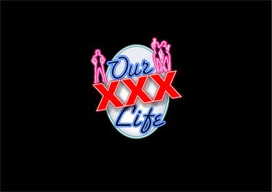
Logo Design for ourxxxlife.com
- Status: Closed
- Prize: $290
- Entries Received: 1
- Winner: fcukroyalty

Contest Brief
Amateur Adult Content Website. We Provide customers with access to our archive of adult related content with a monthly subscription.
Recommended Skills
Employer Feedback
“Great Freelancer !! Very Impressed ! She worked very hard to submit the logo that I wanted for my contest and made many changes when requested. She will be my first pick next time. ”
![]() splatnet, Canada.
splatnet, Canada.
Public Clarification Board
-

sanjayrani2011
- 11 years ago
Sir ..ny feedback for #100 #112 #26? thank you
- 11 years ago
-

mamoli
- 11 years ago
Congrats fcukroyalty!
- 11 years ago
-

fcukroyalty
- 11 years ago
Thanks mamoli!
- 11 years ago
-

Contest Holder - 11 years ago
I want to thank everyone for submitting their entries. I appreciate the effort that you all put in here. There were a few really good ones but I narrowed it down to 2 exceptional designs from fcukroyalty and mamoli. After careful consideration, I have decided that the design from fcukroyalty was the closest to what I was looking for. Congratulations fcukroyalty !
- 11 years ago
-
fcukroyalty
- 11 years ago
Thank you so very much! Uploading the files now. : )
- 11 years ago
-

williamdaniel
- 11 years ago
i havea a design ready :S
- 11 years ago
-

SteveJobsdesign
- 11 years ago
#133
- 11 years ago
-

ulogo
- 11 years ago
#119 #121 #122 Thanks!
- 11 years ago
-

stephen66
- 11 years ago
#126 I added another figure in the background, very descret... hope you like it :) Stephen
- 11 years ago
-

Delinquente
- 11 years ago
Hi,please check #125 ty
- 11 years ago
-

beko75
- 11 years ago
#101 #102 Thanks!
- 11 years ago
-

BevUK
- 11 years ago
please check out #117 and #120 and let me know if I am on the right track
- 11 years ago
-

hammad143
- 11 years ago
please see #89, w8ng for your feedback thanks..
- 11 years ago
-
Contest Holder - 11 years ago
Not bad. It might need some texture and the oval looks too much like an egg
- 11 years ago
-
hammad143
- 11 years ago
what about #118 , please..!!
- 11 years ago
-

thekingmaker
- 11 years ago
Dear sir, any feedback for #111 #112 #113? thank you
- 11 years ago
-
thekingmaker
- 11 years ago
#115 and #116 too....
- 11 years ago
-

dasilva1
- 11 years ago
Please take a look my entry #114 thanks!
- 11 years ago
-
fcukroyalty
- 11 years ago
#86 would love to hear your thoughts : )
- 11 years ago
-
Contest Holder - 11 years ago
Your design is shortlisted. It looks a little too different from the original though.and only shows 2 silouettes. Overall, I like the direction you are going. can you make one more ?
- 11 years ago
-
fcukroyalty
- 11 years ago
Of course: #106 and #107
- 11 years ago
-
PlatinumStudios
- 11 years ago
#105 is just a preliminary concept. The partial Silhouette can be replaced by the actual actors themselves in pose. I think this style of peek-a-boo silhouette gives more to look at rather than just another boring solid black outline, without showing too much distinctive features.
- 11 years ago
-
tomaszziolkowski
- 11 years ago
Hi, #104. Thank You
- 11 years ago
-
Contest Holder - 11 years ago
Many of you are missing the mark with the silouettes. If you are going to use them, there should be 3 or more. 2 Girls and a Guy. Also, the logo needs to look similar to the original, but just needs some texture, depth, effects. A modern and professional twist.
- 11 years ago
-
tomaszziolkowski
- 11 years ago
Hi, please check #94, #95. Thank You
- 11 years ago
-
BevUK
- 11 years ago
please let me know what you think of #93
- 11 years ago
-
fcukroyalty
- 11 years ago
Please check my private message for #87.
- 11 years ago
-
stephen66
- 11 years ago
#82 by bringing the circle up give's more space for the swinger's :)
- 11 years ago
-
stephen66
- 11 years ago
#83 sampled on your site...
- 11 years ago
-
stephen66
- 11 years ago
I made the format different here, You can as you have the space on the website...:) Stephen
- 11 years ago
-

webthink2012
- 11 years ago
sir,please rate #81,hope you like it.
- 11 years ago
-

aliartdesign
- 11 years ago
hi , please check #79 and #80, thank you
- 11 years ago
-

varunthakur27
- 11 years ago
sir plz rate d #62
- 11 years ago
-
aliartdesign
- 11 years ago
hi , can you please check #72, thanks
- 11 years ago
-

Grabunique
- 11 years ago
check #57 ...
- 11 years ago
-
stephen66
- 11 years ago
Here is a new version, opinion usefull :)
- 11 years ago
-
stephen66
- 11 years ago
I hope I have a better vision of your needs :) Stephen66
- 11 years ago
-
Contest Holder - 11 years ago
Ok Freelancers. How about this ? Try to take my current logo at (ourxxxlife.com) and make it better in some way. Give it depth and/or 3D effects and make it look cool. You can use different font styles, sizes and colors, or you can use the same ones. The general look should be similar to the current logo with text over top of an oval or circular shaped background. Silhouettes or other drawn characters or symbols are welcome. If you do include one of these, it should somehow convey a not to obvious image of threesomes or swingers, and should also not be the main focus of the logo. I hope this gives you more direction on what I am looking for.
- 11 years ago
-

enewsome
- 11 years ago
Thank You
- 11 years ago
-
Contest Holder - 11 years ago
Sorry everyone. I am new to the contest thing and didn't realize I needed to rate them. I will rate them from now on, but if your design was rejected it means it was too far from what I wanted.
- 11 years ago
-
varunthakur27
- 11 years ago
sir plz upload or type some link for samples which shows what you are looking for
- 11 years ago
-
varunthakur27
- 11 years ago
dear sir kindly review about #22
- 11 years ago
-
fcukroyalty
- 11 years ago
Hello!
If you like what's happening with #17 or #18, please rate it/give feedbacks so I can make them better for you.
Thanks : )- 11 years ago
-
stephen66
- 11 years ago
Stephen66, there is a smartphone icon, this is why I worked in a box... :)
- 11 years ago
-

distilledesigns
- 11 years ago
#13 is my basic Idea, just want to know weather you like the concept before I proceed and make the logo stunningly good, thanks, pls rate it so that I can evaluate myself
- 11 years ago
-

emhowland
- 11 years ago
Could you please let me know if you like the concept of #8 and #9? I can tweak if you loke where I am going with it. ~Thanks!
- 11 years ago
-

pranav0611
- 11 years ago
if u like my concept plz mail me i will give my best
- 11 years ago
-

y2kbug18
- 11 years ago
hope you like #4
- 11 years ago
-

Darkfox2236
- 11 years ago
Hi!
If you like the concept then i can improve it- 11 years ago
-

xvapur
- 11 years ago
Hey sir please rate and feedback #1
- 11 years ago
How to get started with contests
-

Post Your Contest Quick and easy
-

Get Tons of Entries From around the world
-

Award the best entry Download the files - Easy!