Logo Designing
- Status: Closed
- Prize: $15
- Entries Received: 99
- Winner: alaminshak35

Contest Brief
I need logo for a brand. Details given below -
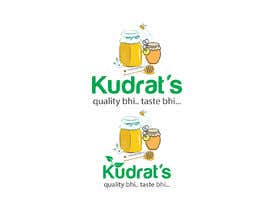
Kudrat's
quality bhi.. taste bhi...
Kudrat is a Hindi word for Nature so it should reflect something related to nature... may be trees, farm field, fruits, honey bee... as per your creativity make something. I assure you it would not be just another logo you'll make but one day you would be proud of it.
Recommended Skills
Employer Feedback
“well out of 100 entries I choose Alamin's because you can see other's and his work. Its far better than other. Moreover he has not just made a logo for me but carved out a brand identity for me. Hire him if you want exceptional quality work. All the best Alamin”
![]() infinets, India.
infinets, India.
Public Clarification Board
-

jain0735
- 2 years ago
Please check #103
- 2 years ago
-

Nurizyanie
- 2 years ago
chcek my entry #102 hope you like it :)
- 2 years ago
-
jain0735
- 2 years ago
Please check #92
- 2 years ago
-

Contest Holder - 2 years ago
thanks everyone for your efforts... good try by all... entry #89 is short listed and i have asked 2 3 small changes... others please check how a logo should look like.. please take my feedback positively and not as criticism
- 2 years ago
-

jadjook
- 2 years ago
please check #84
- 2 years ago
-
Contest Holder - 2 years ago
good try... but it looks too complicated... please take my feedback positively and not as criticism
- 2 years ago
-

Prohan007
- 2 years ago
Please seal the entries
- 2 years ago
-
Prohan007
- 2 years ago
Hello, please check my entry And review it. Entry no #74
- 2 years ago
-

mdmirajshikari
- 2 years ago
DEAR CONTEST HOLDER! PLEASE CHECK #82 &83. I THINK YOU NEED THIS TYPE OF LOGO.I HOPE YOU LIKE MY LOGO
- 2 years ago
-
mdmirajshikari
- 2 years ago
DEAR CONTEST HOLDER! PLEASE CHECK #82 &83. I THINK YOU NEED THIS TYPE OF LOGO.
- 2 years ago
-

HABIB1053
- 2 years ago
#68 check
- 2 years ago
-
Contest Holder - 2 years ago
entry #5 's font and the use of leaf as apostrophe is nice.. just need some property integrated within letters not above or below like few have done
- 2 years ago
-

zayyaninazwewee
- 2 years ago
Kindly check entry #25
- 2 years ago
-

aqilahbohari99
- 2 years ago
kindly check #33
- 2 years ago
-

islamrobiul505
- 2 years ago
sir
#30 by Md R.- 2 years ago
-
islamrobiul505
- 2 years ago
i hope my there have nature in my entry
- 2 years ago
-
islamrobiul505
- 2 years ago
sir please
#22 by Md R.- 2 years ago
-

shahidul202572
- 2 years ago
- 2 years ago
-

muhainia59
- 2 years ago
Hi, please check entry #17 and if you don't mind giving me a star rating of at least one.
I appreciate any help you can provide. Thank you.- 2 years ago
-
Contest Holder - 2 years ago
good try... the tree should not look like dried up and should be integrated in letters... some pine trees can give it a better look i guess
- 2 years ago
-
Contest Holder - 2 years ago
please use lower case for punch line... mostly you should in fact
- 2 years ago
-
Contest Holder - 2 years ago
any new entries before taking any effort please check current 14 entries to see what it should be not like
- 2 years ago
-
Contest Holder - 2 years ago
guys i appreciate your efforts but none are looking natural... sorry
- 2 years ago
-

norazieanaziera
- 2 years ago
Please check my entry and give a star for my design
- 2 years ago
-

Hanissuraya1999
- 2 years ago
Hello sir, hope you can give a star to my logo #2
- 2 years ago
-
Contest Holder - 2 years ago
please I can do that if I just have to write it in different font...
- 2 years ago
How to get started with contests
-

Post Your Contest Quick and easy
-

Get Tons of Entries From around the world
-

Award the best entry Download the files - Easy!