mlm mastery club logo

Contest Brief

MAY 19 UPDATE: 5 more days to finish it up. I like the swoosh coming from below. Final stretch this week. Good luck!
Here is some general feedback / goals for the logo.
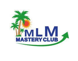
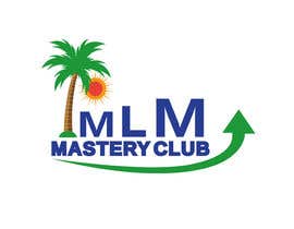
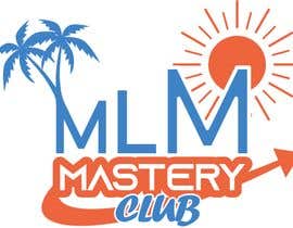
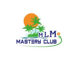
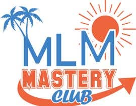
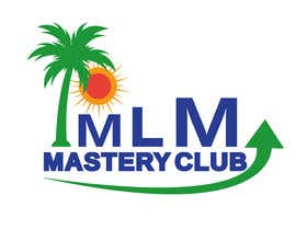
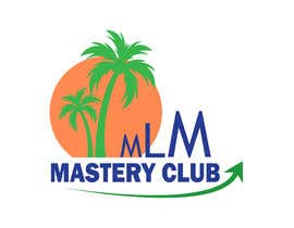
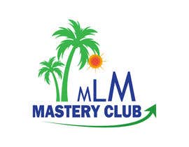
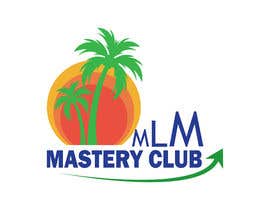
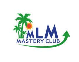
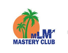
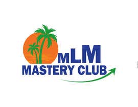
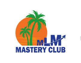
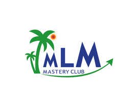
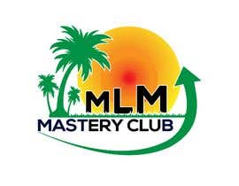
1. I like the swooshing arrow coming from below showing an upward trend of both mastery and rewards.
2. I don't like it going through the letters of the words.
3. I like the growing letters of MLM
4. I would like the words, "Mastery" and "club" to be more pronounced. It is after all through rising MASTERY that your MLM will grow.
5. I like the "fun" nature of club since we will have fun events to help people get mastery of MLMs (Network marketing)
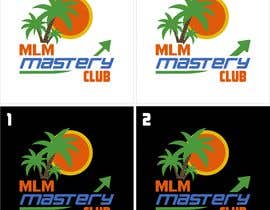
6. PLEASE... NO LOGOS ON walls or paper. Just submit them on a black and white backgrounds to see if there is enough contrast between the chosen colors and a dark/light background
7. VERY IMPORTANT... I need to have a logo that can work both as a square Logo and as a banner logo for email letter heads and login banner. So, embedding the text into the logo could cause problems unless you are creative and can show me how it can be done. The winner(s) - (yes, I'm open to that) will display both the square and banner logo configurations. If you just want to only do the square one for now, that's okay, but before the final decision of the winner is announced, I will want to see how both forms look.
Good luck and thanks for your particpation and creativity!
Keep smiling, Ron

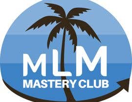
MAY 6, 2021 UPDATE: I like the upward trend arrows, but not the zig-zag lines before them. I would like the arrow swooping upward like an upward trend to success. I am not looking for the arrow to come back to the center. Think of it as building a better future because of your success. The money bags are too much hype. I want someone to see the logo and think, "If I join this club, my future will be better." The palm tree and beach are nice, but equal to the fact that joining the club will make it possible to get there as my fortune and accomplishments improve. Hope this helps.
Good luck!

MAY 3, 2021UPDATE: Let's try to come up with logos that would show an upward trend arrow. Mastery is important. Palm trees are nice but I want to see something that implies an upward trend representing mastery. I still want the "fun" aspect of a club but NOT as a cartoon logo.

We are creating a new website and would like to a graphic artist or logo designer to create a new logo for my project.
I will use the logo for the website, letterhead, email banner, mobile app logo and startup screen, etc.
MLM Mastery Club is the name of the project.
I'd like to evoke fun and profitability in the logo.
I created my current logo, but I have been told it looks too much like a travel agency.
I'd like to emphasize fun and profit.
We have a membership website and teach network marketers how to build a network marketing company in a fun and profitable way.

I've included some logo designs I already did.
I like the colors but am open to suggestions.
I would like the final delivery to include source files.
I use affinity designer. It would be extra points if I could open and change the files using Affinity Designer (Similar to illustrator)
You can earn some extra money after I choose the logo to animate it for use as video stingers or the opening page of a mobile app.

For starters, I'm looking for:
1. an equal dimension (x-y) logo with text and graphics,
2. a horizontal banner logo (wider than tall) with text and graphic, and
3. a favicon image that will stand out on a busy browser tab list.
4. logo must work as png on light or dark background with chosen logo colors.
5. please emphasize FUN... AND PROFIT.
6. bonus stars if I can get the file in Affinity Designer file format.

I am noticing everyone has the palm trees. I like that, but I also like that some have added a reference to money (i.e. money bag, $$$, and up arrows, etc.) -- Very creative work!
Thanks!
Ron

Recommended Skills

Employer Feedback

“Rodolfo is an excellent graphic artist and did a great job on my logo. I'll hire him again. I highly recommend his work.”

Profile image sharetheoils, United States.

Top entries from this contest

View More Entries

Public Clarification Board

  • Aminul5435
    Aminul5435
    • 2 years ago

    It was a waste of time for me

    • 2 years ago
  • Aminul5435
    Aminul5435
    • 2 years ago

    #402 ..Are you online ?

    • 2 years ago
  • Aminul5435
    Aminul5435
    • 2 years ago

    Hello

    • 2 years ago
  • kaif392
    kaif392
    • 2 years ago

    pls check #383

    • 2 years ago
  • Aminul5435
    Aminul5435
    • 2 years ago

    Are you online ?

    • 2 years ago
  • Farhanparach
    Farhanparach
    • 2 years ago

    PLEASE CHECK#355 THANKS

    • 2 years ago
  • Aminul5435
    Aminul5435
    • 2 years ago

    #352 See my design. I tried to do exactly what you told me to do.

    • 2 years ago
  • Aminul5435
    Aminul5435
    • 2 years ago

    Check #352

    • 2 years ago
  • Farhanparach
    Farhanparach
    • 2 years ago

    PLEASE CHECK #330 THANKS

    • 2 years ago
  • Aminul5435
    Aminul5435
    • 2 years ago

    Check please #298 #307

    • 2 years ago
  • Aminul5435
    Aminul5435
    • 2 years ago

    Check #297 ..please provide feedback for any more change. Thank you

    • 2 years ago
  • Aminul5435
    Aminul5435
    • 2 years ago

    #296 ...please provide feedback for any change.

    • 2 years ago
  • BiltonFL
    BiltonFL
    • 2 years ago

    Please check #292

    • 2 years ago
  • Aminul5435
    Aminul5435
    • 2 years ago

    #286 please provide feedback for any change

    • 2 years ago
  • Aminul5435
    Aminul5435
    • 2 years ago

    #286

    • 2 years ago
  • Hamzazemharir
    Hamzazemharir
    • 2 years ago

    please check #289

    • 2 years ago
  • Hamzazemharir
    Hamzazemharir
    • 2 years ago

    please check #288

    • 2 years ago
  • Aminul5435
    Aminul5435
    • 2 years ago

    okey

    • 2 years ago
  • sharetheoils
    Contest Holder
    • 2 years ago

    Could contest participants please review my most recent Details section. There are clues there to help you win! :)

    • 2 years ago
  • sharminnaharm
    sharminnaharm
    • 2 years ago

    #287

    • 2 years ago
  • Aminul5435
    Aminul5435
    • 2 years ago

    check #286

    • 2 years ago
  • sarfidogardogar3
    sarfidogardogar3
    • 2 years ago

    please check my entry #280

    • 2 years ago
  • diptisarker1
    diptisarker1
    • 2 years ago

    CHECK#278

    • 2 years ago
  • sharminnaharm
    sharminnaharm
    • 2 years ago

    #267,#268

    • 2 years ago
  • Hamzazemharir
    Hamzazemharir
    • 2 years ago

    please check #264

    • 2 years ago
  • sharetheoils
    Contest Holder
    • 3 years ago

    There have been a lot of nice entries. I have extended the contest another 5 days to hone the logo a bit more. I will add comments to the various entries to see how we can improve them.
    Thanks again for all of your competitive spirit and great entries.
    Keep smiling, Ron

    • 3 years ago
    1. navidzaman001
      navidzaman001
      • 3 years ago

      please check my update entry #164

      • 3 years ago
    2. zubairsfc
      zubairsfc
      • 2 years ago

      Hi sir Please check my profile portfolio https://www.freelancer.com/u/zubairsfc if like profile please contact me private message and quick response always online i am waiting for feedback now Thanks.

      • 2 years ago
  • rksolution2005
    rksolution2005
    • 2 years ago

    Please Check #222

    • 2 years ago
  • Dferdusi8005
    Dferdusi8005
    • 2 years ago

    Please check #236

    • 2 years ago
  • raselgd667
    raselgd667
    • 2 years ago

    please check my entry #235

    • 2 years ago
  • TYM Solutions
    TYM Solutions
    • 2 years ago

    #225 #226 #227 please check and provide your valuable feedback .Thankyou

    • 2 years ago
  • rksolution2005
    rksolution2005
    • 2 years ago

    Please Check #222

    • 2 years ago
  • rashu014
    rashu014
    • 2 years ago

    this client is thinking he has brought us by increasing 2$ every two weeks and expects us to redesign. At least i am not working now. I am withdrawing my entry. this is stupid to work for months just to get 20$. Good luck to you

    • 2 years ago
    1. SaaDAwan08
      SaaDAwan08
      • 2 years ago

      same

      • 2 years ago
  • rashu014
    rashu014
    • 3 years ago

    Please review #145 and #146.
    The ones you are giving 3 and 2 stars can't be used on website as they are not organized.

    • 3 years ago
  • nkeagles
    nkeagles
    • 3 years ago

    Hello Sir, kindly give your feedback on #122 and #124. Thank you!

    • 3 years ago
  • aniktheda
    aniktheda
    • 3 years ago

    #194, #195

    • 3 years ago
  • sharetheoils
    Contest Holder
    • 3 years ago

    Please put logos on white and black background. I will never have it on a wall, or embossed on paper, etc.

    • 3 years ago
  • nkeagles
    nkeagles
    • 3 years ago

    Please check #124.

    • 3 years ago
  • nkeagles
    nkeagles
    • 3 years ago

    Please check #122.

    • 3 years ago
  • rashu014
    rashu014
    • 3 years ago

    Please send me a message so that i will send you a logo in dark background

    • 3 years ago
  • Aadarshsharma
    Aadarshsharma
    • 3 years ago

    working please wait.

    • 3 years ago
  • sharetheoils
    Contest Holder
    • 3 years ago

    Please read updated details page. Thanks!

    • 3 years ago
  • Stuart019
    Stuart019
    • 3 years ago

    Check #25 please

    • 3 years ago

Show more comments

How to get started with contests

  • Post your contest

    Post Your Contest Quick and easy

  • Get tons of entries

    Get Tons of Entries From around the world

  • Award the best entry

    Award the best entry Download the files - Easy!

Post a Contest Now or Join us Today!