Packaging Box Design for Cherub Baby
- Status: Closed
- Prize: $290
- Entries Received: 5
- Winner: Decorsmith

Contest Brief
Our company Cherub Baby has a range of baby feeding products, from breast pumps, to glass baby bottles to bottle warmers.
We have existing packaging for the whole range but we are seeking to give the whole range a 'facelift'
The successful applicant wil
Recommended Skills
Public Clarification Board
-

tokaa
- 12 years ago
Please wait for my entry I will submit in a few hours.
- 12 years ago
-

Decorsmith
- 12 years ago
Hi,
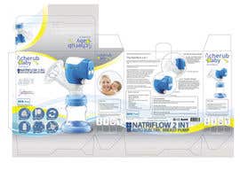
Sorry that the color of #1 is a little bit strange. We have uploaded the artwork again. Please check #2 . Please give us comment so that we can improve the design. Many thanks!- 12 years ago
-

Contest Holder - 12 years ago
Thanks for your design, there are many parts of it I really love especially, the silver/grey at top and bottom and also the yellow ribbon is perfect. Can I make a few suggestions:
1. Please check our template layout in the attached zip files.
2. Please shrink the NATRIFLOW 2 IN 1 ..... text and move it to the top left of the front panel under the logo.
3. The 5 dot points on the front panel, we are hoping to express them as icons/logos. For example "full silicon breast shield". We would like a circular logo showing a breast shield and perhaps the text under. So we would have 5 logos running from the bottom left of the front panel and each logo depicts the different features. Also incorporate the other existing logos on the design (such as "bpa free") into the same style as the new 5. So all logos and positioned in the bottom left area and look the same style.
I hope this makes sense! I really look forward to hearing back and hope you can make the changes.- 12 years ago
-
Decorsmith
- 12 years ago
HI, Thanks a lot for your comments. Hope you like our alterations. Please check #10 . If you have any further comments, please feel free to let us know and we will alter you feel satisfy. many thanks !
- 12 years ago
-

R063rt
- 12 years ago
Any comment?
- 12 years ago
-

doncedesign
- 12 years ago
Dear Voltron1124, firstly I would like to express my emotion for participate in this contest, I hope to find your favourite style and to help you on all range of products design with new, modern and eye-catcher image!
Please provide some comments, suggestions or opinions in order to improve my uploaded design, I'll be very grateful for that! At meantime, I'll be working on some more product packaging design so you can see more ideas...
Thank you!
Best regards!- 12 years ago
-
Contest Holder - 12 years ago
Hello,
Thanks for your designs! There are some great elements to them. My suggestions for improvements mostly relate to the parts of the brief I feel have not been addressed in your design. Mainly:
- make a bolder colour scheme that is more neutral in color (we are looking at silver/grey main theme but pull through the yellow and blue in the logo)
- logo stays the same.
-the packaging should highlight the key 'unique' features of the product.
- Please also check 2. Zip file with images of the direction we are looking to take with this new packaging.
Thanks and great work!- 12 years ago
-

acsemy
- 12 years ago
When designing this one was a little more complicated because it is a lot of items. Do you have a chance to eject some of the things I wonder? where particular parts of the product ... this is my personal opinion, please check #6, thanx.
- 12 years ago
-
Contest Holder - 12 years ago
Hi Acsemy,
Thanks for your comments. There are some great elements to your design but I have a few suggestions I hope you can look into.
1. The brief has an attached zip file of artwork showing the direction we are looking to take with the new packaging. Please have a look at this:
2. The brief also notes: make a bolder colour scheme that is more neutral in color (we are looking at silver/grey main theme but pull through the yellow and blue in the logo)
3. The brief notes: We are looking to keep the 'ribbon' that runs horizontally along the front face. Please check the breast pump packaging to see this ribbon.
I think there are some great elements to your design so great job! However personally I would like to see some changes as noted above for it to meet our needs. I hope this helps!
Thanks!!- 12 years ago
-

wik2kassa
- 12 years ago
Hello Contest Holder,
I am most delighted to work on this project. I would really appreciate if you can upload high quality versions of your logo and images of the products.
Thanks.- 12 years ago
-
Contest Holder - 12 years ago
Hello,
We have uploaded a high res logo and also the artwork. Thanks- 12 years ago
-
Decorsmith
- 12 years ago
Hi,
Please kindly check #1. Please let us know if you have any comment so that we can modify and improve the design.
Looking forward to hearing from you soon!- 12 years ago
How to get started with contests
-

Post Your Contest Quick and easy
-

Get Tons of Entries From around the world
-

Award the best entry Download the files - Easy!