Sales Email Brochure Design for Waywest Lighting & Camera Inc.
- Status: Closed
- Prize: $190
- Entries Received: 11
- Winner: smarttaste

Contest Brief
I rent cameras to the video and film industry
Recommended Skills
Employer Feedback
“Smarttaste was the only contestant that really listened to all of the specifics I was asking for. He had a great sense of color, balance and design. ”
![]() gaffergreg, United States.
gaffergreg, United States.
Public Clarification Board
-

GraphicsStudio
- 12 years ago
Pls tell me about #28 , Thank You
- 12 years ago
-

Contest Holder - 12 years ago
I just saw your message. #28 has been withdrawn so I can critique it. I apologize for ending the contest too soon. I didn't realize I was supposed to wait the entire time.
- 12 years ago
-
GraphicsStudio
- 12 years ago
#28 is ON
- 12 years ago
-

vidhisha11
- 12 years ago
sir you declared the winner before time............ no probs can you rate my work....thanx
- 12 years ago
-
GraphicsStudio
- 12 years ago
end ?
- 12 years ago
-
GraphicsStudio
- 12 years ago
Dear CH 4 godizny worked on advertising, and you have selected?
- 12 years ago
-

davidotcom
- 12 years ago
Thank you gaffergreg, for your very kind compliment. I really love to create something that would approach my customer to the feeling of possessing something of high value, unique and precious. I created one more for you, Pls. see #26
- 12 years ago
-
Contest Holder - 12 years ago
Message to everyone...
Thank you for your hard work! I am going to choose smarttaste as the winner after a link is added to my website.
Davidotcom-you are very skilled and I hope to contact you for a real paid job in the future. Your work definitely caught my eye but in the end I loved #23 .
Enderiplikci- #24 looks really good. It's simple and clean. Thank you for trying so hard.- 12 years ago
-
Contest Holder - 12 years ago
TO ALL: PLEASE ADD LINK TO MY WEBSITE
waywest.TV
Thank You!- 12 years ago
-
Contest Holder - 12 years ago
#19 : I love the font you chose for "ALEXA". That is the company font that everyone recognizes.
#19 : Remove "special offer" and if you need a rate favor don't hesitate to call"
#19 : Contact info-address needs to be two lines and my cell and email need to be two lines
#19 : The text needs to read exactly like #17 with the first letter capitalized and the second line a smaller font as in #8
#19 : The background is too busy in the center
#19 : The white dot is boring. How about a red, blue or yellow arrow like #8?
$19: The words "ONLY FOR" should be removed and the green color changed to red or blue.
#19 : "Hi tech, adorable price!" should be completely removed- 12 years ago
-
Contest Holder - 12 years ago
#16 : I love how clean this is. The background is not too busy.
#16 : The "Waywest" logo needs to move to bottom of page and be replaced with "ARRI ALEXA Package"
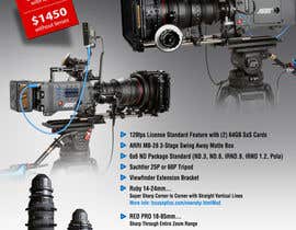
#16 : The red sticky note needs to separate from camera, and just have the price only "$1950 with lenses" "$1450 without lenses"
#16 : The spacing between the lines needs to be even
#16 : the second line on the bullet points needs to be a smaller font size
#16 : The red dot and red line need to be made blue OR the red dot need to be a small arrow or something else. The reason is a competitor camera is called the RED ONE and their logo is a red dot.
#16 : This is the only entry with the correct punctuation and text for the bullet points- 12 years ago
-
Contest Holder - 12 years ago
From Gaffergreg:
1. I like the bullet points on #8: The words stand out, The text is correct with the first letter caps. The second line is smaller and it has a nice icon to the left of each sentence.
2. On #8: I don't like the different fonts and colors on my contact info
3. On #8: I like the black mirror background but it is just a little too busy. The parallel lines that connect the top camera and run to the edge of the page on top right are too much. The cloud whisp that connects the top lens and bottom lens is too much.
4. #8: "ARRI ALEXA" needs to be the same color. The word "Package" stands out too much and the price is too small.
5. #8: The price is too small and I don't like the stars- 12 years ago
-

noteableart
- 12 years ago
#15 Hello, I can make modifications as per your request. Thanks
- 12 years ago
-
corpuzmanolito
- 12 years ago
please check and feedback #6. Thanks
- 12 years ago
-

Anamh
- 12 years ago
size?? plus u wana foldes??
- 12 years ago
-

StrujacAlexandru
- 12 years ago
can you please seal the contest ?
- 12 years ago
-
farhan1989
- 12 years ago
i agree with you :)
- 12 years ago
How to get started with contests
-

Post Your Contest Quick and easy
-

Get Tons of Entries From around the world
-

Award the best entry Download the files - Easy!