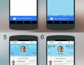
Screen redesign - QRID app - password-less login for internet sites, comes with Bitcoin Wallet built-in for tipping Bitcoins to other internet users
- Status: Closed
- Prize: $400
- Entries Received: 14
- Winner: mariafet
Contest Brief
Intro:
=====
QRID allows people login to websites by scanning QR code on their monitor. No passwords are needed. We are liberating people from passwords :) Besides logins, QRID app also has Bitcoin Wallet built-in. You could read more about the app at QRID.com website. Our target audience is mainstream technical internet users, like computer programmers, designers, etc.
Design :
======
We are trying to find some "branding" elements and redesign the following:
1) our main screen (aka "wallet" screen, mocks and screenshots attached)
2) our "scan" screen (screenshot attached)
3) maybe logo might need to be slightly tweaked to reflect branding. Right now our logo is simple blue square with white QRID letters in it - you could see it at QRID.com when we show the sample of the login page that uses QRID tech.
So please submit at least 2 images for screens 1) and 2), and maybe 3rd image for altered logo if you happen to have some idea on how to improve it.
We already have a working app currently being tested (some screenshots attached) but it needs to be dressed up so it looks a bit more polished.
What we need for "wallet" screen is pretty close to what is displayed at the "Version 6" and "Version 7" mocks.
Here is what you do not need to change much on the "wallet" screen:
- other than avatar images and maybe colors, list of transaction CELLS is going to look pretty close to what is on the mock "Version 6". This is because each cell needs to collapse / expand and certain built-in Android styles are used here. However, it is still somewhat customize-able, so feel free to change minor easy things like colors, avatar picture style, buttons in the expanded cell
Here is what we WANT you to change:
- color schema - feel free to pick colors as needed for any element. Keep in mind that we already have that square blue QRID logo, however, we might consider to alter logo or logo colors if necessary
- top tabs menu - could be with light (white?) background, or with dark (blue?) background - both are easy programmable so feel free to experiment here. Still should be something that we would be able to program later on
- section of the app where balances are displayed - please please work on blending some nice background textures. Search google for "bitcoin texture", "techno texture", "square texture", "electronics texture", whatever, browse your stock images. I believe those areas need some carefully selected textures that would reflect our brand somehow. I've seen textures made off QR codes too lol
- some BRANDING ELEMENTS. Every decent app has some branding elements like skype has its cloud, and so on. Ideally, logo could provide some "branding" component, but our logo is just a simple square. But it definitely can provide at least color. So if for some reason you could come up with some branding elements for our logo, we would consider changing the logo. We need some touch of "branding" in our design. Well, maybe background images at the top section will be enough. Also, in the mocks there is a "Scan" screen that is actually where the app starts first when it is being launched. Most of the time users launch the app to scan QR code on their login page - they just want to login, do not need to see the wallet, so the app starts with the "Scan" screen. Ideally, branding should be also somehow applicable to the 'Scan" screen too. Let's see what you guys could come up with :)
Updated (March 22):
please keep in mind that color schema that you choose should also be applicable to the web - i.e. we have QRID login page (attached 2 mocks) and it has QRID logo which should be using same color schema as used in the app. We could change the logo color on the web if necessary. Just make sure that your colors would look good on that login page, or maybe just include a mock of that login page (it is quite simple page with just 3 elements - pls see the mocks attached) Thank you!
Recommended Skills
Public Clarification Board
-

ktappteam
- 8 years ago
Hello, can you #extended project for 2days more?
- 8 years ago
-

Contest Holder - 8 years ago
Unfortunately we will not be extending it. It will close later on today - I believe there are still about 8 hrs to go
- 8 years ago
-

ktappteam
- 8 years ago
i just need more time to design
- 8 years ago
-

ohmyfunsite
- 8 years ago
Hi sir! Please send me a feedback about #27 . Thanks! :)
- 8 years ago
-

Contest Holder - 8 years ago
replied, thank you!
- 8 years ago
-

ohmyfunsite
- 8 years ago
thanks, sir. I replied. :)
- 8 years ago
-

Contest Holder - 8 years ago
I've uploaded one more MS Word file called "QRID_APP_Design_Notes.docx". It has examples of that "matherial design" cells that we are going to use for the transactions list elements. Also it contains some techno/futuristic/digital texture images. Maybe these images could help. Not sure if we need those images though. Ideally, texture should reflect branding or logo elements or something related to the brand. So, it might be difficult to link those images to brand. Anyways, pls take a look at that file and images. Thank you!
- 8 years ago
-

algor7
- 8 years ago
Please check #25
- 8 years ago
-

algor7
- 8 years ago
Please do comments..
- 8 years ago
-

Contest Holder - 8 years ago
rated and commented, thanks!
- 8 years ago
-

Contest Holder - 8 years ago
Sure it is going to stay open for the whole term (I think another 3 days or so)
- 8 years ago
-

ktappteam
- 8 years ago
Please dont give 5star rate, cuz nothing is perfect, thanks
- 8 years ago
-

Contest Holder - 8 years ago
Agree, nothing is perfect.
- 8 years ago
-

Contest Holder - 8 years ago
Updated (March 22):
================
please keep in mind that color schema that you choose should also be applicable to the web - i.e. we have QRID login page (attached 2 mocks) and it has QRID logo which should be using same color schema as used in the app. We could change the logo color on the web if necessary. Just make sure that your colors would look good on that login page, or maybe just include a mock of that login page (it is quite simple page with just 3 elements - pls see the mocks attached) Thank you!- 8 years ago
-

ktappteam
- 8 years ago
I will upload soon
- 8 years ago
-

cretivedesigner1
- 8 years ago
sir please check one more design with background #21
- 8 years ago
-

algor7
- 8 years ago
Please wait for my entry..
- 8 years ago
-

nicklogos
- 8 years ago
#16 pls rate
- 8 years ago
-

nicklogos
- 8 years ago
#16 rate pls and say something that you dont like about it ;)
- 8 years ago
-

Contest Holder - 8 years ago
Maybe we need SQUARE profile pictures, not ROUND ones? B/c our logo is square, QR codes are square too. Also, what is our brand? It is QR+ID. What do we have in this mock that represents ID? It is user's profile picture. So to reflect QR+ID we need to use square photo with blended QR code around it or some other merge between stylistics of QR elements and progfiel photo. Just thinking out loud ... maybe this idea could be helpful here
- 8 years ago
-

nicklogos
- 8 years ago
making these
- 8 years ago
-

Contest Holder - 8 years ago
Just FYI guys, I am working both Saturday and Sunday full days, so please feel free to continue over a weekend - I will be here online b/c there is a lot of things that need to be done
- 8 years ago
-

nicklogos
- 8 years ago
i will think and make more better looks like fise stars
- 8 years ago
-

nicklogos
- 8 years ago
#9 what you wont to chagne
- 8 years ago
-

Contest Holder - 8 years ago
replied in a PM, thanks!
- 8 years ago
-

Contest Holder - 8 years ago
Hi guys, we need more ideas. I encourage everyone to submit their vision for this UI. Thank you!
- 8 years ago
-

ktappteam
- 8 years ago
So how many screens total?
- 8 years ago
-

Contest Holder - 8 years ago
3 images, 2 screens - 1) Wallet screen with transactions, 2) Wallet when no transactions, 3) Scan Screen (with QR scanner). Thank you!
- 8 years ago
-

Contest Holder - 8 years ago
I am done for the day (it is 3 AM here and I need some rest now). Will continue tomorrow - slowly during the day and more in the evening. I am in California currently which is Pacific Time which is UTC-08. Thanks!
- 8 years ago
-

Contest Holder - 8 years ago
If you are going to introduce some "branding", please consider "SCAN" screen as well. It is very simple screen with QR scanner, but ideally we want to brand it too
- 8 years ago
-

Contest Holder - 8 years ago
Posted another IMAGE FILE called "App_Main_Version_6_LARGE.PNG". It highlights "Version 6" in a more clear form. Also I've outlined the SCROLL area. Not just transaction list, but the whole thing scrolls up, including that area with Balance and Profile picture. Only top tabs and bottom "SCAN" area remain fixed. Everything in the middle is one large scroll area.
- 8 years ago
-

nicklogos
- 8 years ago
#8 and tell me what you dont like
- 8 years ago
-

Contest Holder - 8 years ago
replied
- 8 years ago
-

nicklogos
- 8 years ago
#7 look and tell me what can i cange
- 8 years ago
-

nicklogos
- 8 years ago
change
- 8 years ago
-

ktappteam
- 8 years ago
What type of file do you need? psd?
- 8 years ago
-

Contest Holder - 8 years ago
Eventually would need vector file like PSD or AI, and high quality renders for some elements for different Android screen densities. However, for now, I just need rendered images of those screens so we could evaluate various designs.
- 8 years ago
-

mariafet
- 8 years ago
I am in!
- 8 years ago
-

Contest Holder - 8 years ago
You are very welcome! Also, I am going to post some clarifications, maybe some examples of background textures to help the creative process ...
- 8 years ago
-

nicklogos
- 8 years ago
making new dsign wat sir
- 8 years ago
-

cretivedesigner1
- 8 years ago
working on it sir please wait for my creative entry
- 8 years ago
-

Contest Holder - 8 years ago
Sure, please take your time. The contest is open
- 8 years ago
-

Contest Holder - 8 years ago
Eventually some vector, I think PSD or AI. But for now just need rendered screen images. Thanks!
- 8 years ago
-

ktappteam
- 8 years ago
I will propose my work soon!
- 8 years ago
-

stylishwork
- 8 years ago
Iam in
- 8 years ago
-

Contest Holder - 8 years ago
Thank you, looking forward to seeing your version of this UI!
- 8 years ago
-

zuiguanglong
- 8 years ago
I hope to work with you. I have experiences in developing for android UI.
- 8 years ago
-

Contest Holder - 8 years ago
That's great, as you might see we are trying to stay close to matherial design overall, but do not use round floating buttons because I absolutely hate the look when you have one round floating button howering on top of everything all the time. Would love to see you posting your vision of this UI, thank you!
- 8 years ago
How to get started with contests
-

Post Your Contest Quick and easy
-

Get Tons of Entries From around the world
-

Award the best entry Download the files - Easy!

