Freelancer:
shxxn

You'll love this :)
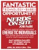
I didn't use any of your images other than the logo, because I didn't think they were very necessary. I made the background an extension of the logo in the sense that I split it into the two shades of red divided by a curve. The text is bold and attractive yet professional like you wanted. This typographic style poster works because the bold text and the lack of plain imagery grab the viewers attention. Its readable up close and a far. College students on the go to lectures etc will still have a chance to fully consume all the information on the flyer even if they just glanced at it for a few seconds. I'm available 24/7 to make any changes you would like to the flyer. Hope to hear from you soon. Have a great Job Fair!