Design a Landing Page/Squeeze Page - Content Provided

  • Status: Closed
  • Prize: $150
  • Entries Received: 12
  • Winner: rainbowfeats

Contest Brief

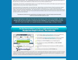
We need a landing page/squeeze page designed from scratch. We are providing the content, and we need competent and experienced landing page designers to take this content and turn it into an eye catching landing page that converts. The goal of this landing page is to get the user to provide their name and email address and submit an opt-in form. The opt-in form contains three fields: username, name & email address

The final design should make use of a combination of graphics and HTML / CSS.

There are four attached word files. The first one contains the color scheme that should be used and the website this landing page will be used on (basically further instructions that we didn't want indexed by search engines). The landing page that is designed should match the color scheme and overall branding that this landing page will be used on. We have also attached three graphics (our logo, and two other pre-designed graphics that should or can be used, along with what you as the designers come up with).

The other three word files contain the pre-written content that needs to be used (above and below the fold, and how the opt-in form should read). The text is formatted but that doesn't mean we want the font or even font sizes used in the word file used on the landing page. It simply has bold, underline & italics used within the sales content, but it is up to the designer to emphasize and differentiate the text that we have designated in the word file in a fun, creative & attractive manner.

We would like this landing page designed so that the "above the fold" content appears as it's own area, kind of as though it is it's own squeeze page. Meaning it just has the headline, a sales video, a few bullet points about the product and then a big call to action and the email submit form. This is to convert users immediately who are "ready to go" and don't want or don't need to read the "sales content" below the fold. There should be a lot of emphasis on getting the user to watch the video and to submit the opt-in form without doing anything else.

There should then be an area in the "above the fold" area, that references that there is "more content below if you're still not convinced". It is here that the page will take on more of a "sales page" type feel, using classic "pitch style, emotion building" sales content.

Both the above & below the fold design should be very eye catching and flashy to "catch and hold" the readers attention while still making it easy to continue to read the content on the page.

If you have any questions about what text requires emphasis or really any questions at all, please post them and we will immediately get back to you with answers.

In the text files, please don't include in the final design the "informational headers" such as: HEADLINE, GRAB ATTENTION or FORCE A PSYCHOLOGICAL COMMITMENT TO READ THE CONTENT ON THE PAGE and so on. They are there for reference only.

Recommended Skills

Employer Feedback

“RainbowFeats did an outstanding job designing a very detailed & attractive landing page for me. I already have worked them into my future plans for my nearly constant need for such designs, that's how great the work they did was. I highly recommend them, as not only is their communication excellent, they also do great work and have a strong desire to make sure they satisfy their clients (as demonstrated by request for additional changes and them almost immediately satisfying that request). Thanks again guys, I'm happy to have worked with you and definitely will again!”

Profile image rjeaton1, United States.

Public Clarification Board

  • creativeideas83
    creativeideas83
    • 10 years ago

    Hi, Kindly check my entry #11 and give your feedback.
    Check #12 for better view.


    --
    Thanks

    • 10 years ago
  • rainbowfeats
    rainbowfeats
    • 10 years ago

    Please wait for my entry, will submit soon....

    • 10 years ago
  • creativeideas83
    creativeideas83
    • 10 years ago

    Hi, Thanks for the invitation.
    Will came back with design soon.

    Thanks

    • 10 years ago
  • bdtechcenter
    bdtechcenter
    • 10 years ago

    why???????????

    • 10 years ago
  • updated6188
    updated6188
    • 10 years ago

    Please review entry #9

    • 10 years ago
  • rjeaton1
    Contest Holder
    • 10 years ago

    I just want to point out that we are relying on your expertise as designers to choose appropriate things like: font, background color, etc.

    While we would like to see the overall color scheme and branding of our site maintained, we do not want to sacrifice the main end goal, which is conversions.

    If you as a designer think that the page would be better suited to have black text on a white background (that's just an example to get my point across) and an entirely different font than what is currently used on the rest of the site, that is absolutely fine.

    Feel free to use the color scheme currently employed on the main site in whatever way you choose...it doesn't have to be a black page with white text and blue & silver accents.

    The end result should be an eye catching design that is easy to read, holds attention and gets conversions.

    • 10 years ago
    1. rjeaton1
      Contest Holder
      • 10 years ago

      It should be resolved very soon, I had another conversation with freelancer via their live chat support feature this afternoon, and the problem has been escalated to the proper department. I'll message you again when it is fixed.

      Thanks for you interest in this contest!

      • 10 years ago
    2. rjeaton1
      Contest Holder
      • 10 years ago

      fixed.

      • 10 years ago
  • saptarshinath
    saptarshinath
    • 10 years ago

    Prize is $0? How is that possible?

    • 10 years ago
    1. rjeaton1
      Contest Holder
      • 10 years ago

      There was some kind of bug with Freelancer's site. It's not even possible to hold a contest that offers $0 as prize money, nor would we insult the freelancers on this site by trying to do so. We paid to have our contest featured, and it was originally offering $150 in prize money.

      I tried to INCREASE the prize amount of this contest from $150 to $250, and something went wrong because the prize amount changed to $0. I have a support ticket open (actually, two support tickets) with Freelancer to get this fixed.

      When the error is fixed, you'll see that the prize amount has INCREASED to $250

      • 10 years ago
    2. rjeaton1
      Contest Holder
      • 10 years ago

      Fixed.

      • 10 years ago
  • Pixaart
    Pixaart
    • 10 years ago

    Please review and feedback (Entry #8 ).

    • 10 years ago
  • kumarefusion
    kumarefusion
    • 10 years ago

    Hi Friend, Can you give me more detail..about the design?
    Will your website be related to Nutrition Based website? Because if you can tell us more information then we can provide you more attractive and catchy design. On Top of the header we should start with Video or Sliders of products..
    So please be more informative..

    Thanks
    SUNIL KUMAR

    • 10 years ago
    1. rjeaton1
      Contest Holder
      • 10 years ago

      Hello Sunil,

      Please review the attached documents to the contest brief. I believe all of the information you require is in them.

      The links are:

      http://data.freelancer.com/contest/22057/site%2B%2526%2Bbranding%2Bdetails.docx
      http://data.freelancer.com/contest/22057/opt-in%2Bform%2Bguidelines.docx
      http://data.freelancer.com/contest/22057/above%2Bthe%2Bfold%2Bcontent.docx
      http://data.freelancer.com/contest/22057/below%2Bfold%2Bsales%2Bcontent.docx
      http://data.freelancer.com/contest/22057/logo.png
      http://data.freelancer.com/contest/22057/slicing.png
      http://data.freelancer.com/contest/22057/throwingstar.png

      • 10 years ago
  • Pixaart
    Pixaart
    • 10 years ago

    Please review entry # 5 and kindly let us know any further changes you need.

    Thanks

    • 10 years ago
  • kumarefusion
    kumarefusion
    • 10 years ago

    Can you give me link for word document ..

    • 10 years ago
  • rjeaton1
    Contest Holder
    • 10 years ago

    I tried to INCREASE the prize amount of this contest from $150 to $250, and something went wrong because the prize amount changed to $0. I have a support ticket open (actually, two support tickets) with Freelancer to get this fixed. I just wanted to update everybody who might be wondering why the prize amount shows as zero.

    When the error is fixed, you'll see that the prize amount has INCREASED to $250

    • 10 years ago
    1. updated6188
      updated6188
      • 10 years ago

      Please let me know when your problem is solved. I am interested and working on a mockup. Thanks

      • 10 years ago
  • Pixaart
    Pixaart
    • 10 years ago

    Please review and feedback.

    • 10 years ago
  • bdtechcenter
    bdtechcenter
    • 10 years ago

    The other three word files contain the pre-written content that needs to be used (above and below the fold, and how the opt-in form should read). The text is formatted but that doesn't mean we want the font or even font sizes used in the word file used on the landing page. It simply has bold, underline & italics used within the sales content, but it is up to the designer to emphasize and differentiate the text that we have designated in the word file in a fun, creative & attractive manner.

    • 10 years ago
  • rjeaton1
    Contest Holder
    • 10 years ago

    The below the fold content should be dynamic in the way you read it...it shouldn't just be a wall of text. The right use of graphics, different heading styles & colors, etc, should draw attention to important items and make it easy to read.

    Things like product features & benefits and the "social proof" should be clearly obvious. The metaphor about how choosing the right auction is similar to choosing stock should be in a different font or style altogether (which is why it is completely italicized in the word doc).

    Here are a few example of "below the fold" sales pages that we like (although we'd like something "cleaner"):

    http://logofortress.com/wp-content/uploads/2012/11/PRweb-thread-design.png
    http://logofortress.com/wp-content/uploads/2013/04/logofortress-designs.png
    http://logofortress.com/wp-content/uploads/2012/12/Thread.png

    • 10 years ago
    1. kiti220
      kiti220
      • 10 years ago

      thanks for your posting, http://www.ebagspurse.com

      • 10 years ago
  • rollu7281
    rollu7281
    • 10 years ago

    thanks for the invitation but i only do fixed price jobs and if interested i can show the landing pages done

    • 10 years ago
  • zamaliphe
    zamaliphe
    • 10 years ago

    i have a system that works using cakephp and you cane use it with clickbank with multy landing pages if you like you can pm me fore details

    • 10 years ago
  • rjeaton1
    Contest Holder
    • 10 years ago

    Then there should be some type of graphic to grab attention and point out that there is more information below if they still aren't convinced (as gone over in the word docs we've attached).

    Then the below the fold content shouldn't just be just the text we've given laid out in a "boring" kind of way, but should again use graphics to draw attention to things like social proof (for instance, when mentioning facebook likes there should be a facebook graphic, when mentioning how many tweets there are about the product, there should be the twitter bird, and so on).

    • 10 years ago
  • rjeaton1
    Contest Holder
    • 10 years ago

    To give a clearer idea of what we're looking for, here are a few examples of what the "above the fold" content could look like (obviously not the same, but it's an idea of something we like):

    http://myminiwebsites.com/mmw/images/samples/squeeze-eatthefoodyoulove.jpg
    http://maxmediainc.com/Projects/EddieTemple/MaxaMuscle/SqueezePage/

    The "above the fold" content is provided in the word doc we have uploaded here. Note the use of graphics, nice fonts and variety of colors to get the message to "pop".

    • 10 years ago
  • digiwoo
    digiwoo
    • 10 years ago

    Thank you for invitation. Unfortunately i only accept fixed price jobs as i only work out the best for my projects.
    Good luck.

    • 10 years ago
  • mediatronics
    mediatronics
    • 10 years ago

    Hello sir,
    Thank you for inviting me. I will provide you exact design what you need within 3 days .
    update you soon with draft design
    regards,
    Dee

    • 10 years ago
  • Pixaart
    Pixaart
    • 10 years ago

    Thank you for inviting for contest. Here is the design. Please review and feedback.

    • 10 years ago
  • waaab
    waaab
    • 10 years ago

    Hi.
    Thank you for inviting me. Unfortunately my schedule is full until the end of June so I cannot take more work now.

    Best Regards,
    Attila a.k.a Mooon

    • 10 years ago
  • eclipsetechno
    eclipsetechno
    • 10 years ago

    Hi,
    I am happy to see your invitation to the contest.
    Regards
    Mit

    • 10 years ago
  • websofttech1000
    websofttech1000
    • 10 years ago

    Thanks for inviting us for the contest send you mockup design asap

    • 10 years ago
  • obizzy
    obizzy
    • 10 years ago

    Thanks for inviting us for the contest, we will try to send some designs as soon as possible.

    • 10 years ago
  • honeyweb
    honeyweb
    • 10 years ago

    Thanks for inviting us for the contest, we will be presenting Landing/Squeeze page design very asap, please wait.

    • 10 years ago
  • Manhoc
    Manhoc
    • 10 years ago

    Thanks, This week I will provide you design

    • 10 years ago

Show more comments

How to get started with contests

  • Post your contest

    Post Your Contest Quick and easy

  • Get tons of entries

    Get Tons of Entries From around the world

  • Award the best entry

    Award the best entry Download the files - Easy!

Post a Contest Now or Join us Today!