Design a Logo

Contest Brief

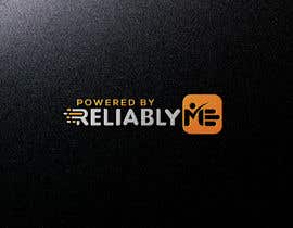
Design a logo that can be used in applications (web, chatbots, mobile apps, etc.) in the form "Powered by ReliablyME", where ReliablyME is both the name of our platform and the new name of our company (we don't currently have a logo for either, as we are in the process of rebranding from http://Trust2Pay.io). We will need a long form of the logo with the word ReliablyME, as well as a square(ish) icon representation.

We are developing a social credit system on a blockchain that empowers people to demonstrate their authentic self and social worth, as an indicator of their true character for easier access to higher education, employment, housing, credit, and insurance. Our ReliablyME platform provides commitments tracking and recognition functionality to any application via APIs. Our startupXchange demo (http://fb.me/sxchange) illustrates the concept. Users receive a badge and a reliability rating when they fulfill their commitment. The badge relates to the nature of the commitment being kept alive and contribute the person's authentic personal brand. Our customers are organizations that issue branded badges and establish the criteria for earning them.

Here is the relevant user persona description:
Let's start with this type of persona http://wavesandthewild.com and refine. We want to appeal mostly to students (teenagers and young adults) who want to be real/authentic. They are anti-fake news and Facebook and want to be associated with a purpose. They are likely female and frequently post about their interests on social media, more so than about their appearance (selfies). They want to feel empowered and in control of their lives. They are proactive and purposeful. They invest in themselves and are committed, self-disciplined, and prepared to delay gratification with an eye on the bigger prize down the road. They are underdogs that feel disadvantaged and want to prove their true self and social worth - they are determined to prove themselves and make it by being recognized and accepted.

We might have difficulty delivering powerfully on a cool factor initially but plan to step up the cool factor over time.

Current thematic ideas include a Scouts three-finger salute and a pinkie promise that could possibly be merged into the ME part. Here are some images that had some appeal:
https://goo.gl/images/fHuvaK
https://goo.gl/images/N3s8gM
https://goo.gl/images/2J1YYE
https://goo.gl/images/QybJVp
https://goo.gl/images/w45m8k
https://png.icons8.com/ultraviolet/1600/realtime-protection.png
https://goo.gl/images/o7yUir
https://goo.gl/images/NVmqfv
https://goo.gl/images/gwknjo
https://goo.gl/images/t3FwRq
https://goo.gl/images/upuCgR
https://goo.gl/images/Re8tNn

Recommended Skills

Employer Feedback

“She is very talented and good at interpreting business requirements. She sometimes has difficulty understanding directions, which can be frustrating and time-consuming.”

Profile image ato5aee0abd93300, Canada.

Top entries from this contest

View More Entries

Public Clarification Board

  • ato5aee0abd93300
    Contest Holder
    • 5 years ago

    Thank you, everyone, for your tremendous support. It was a great experience for me. I am grateful to each of you for submitting so many great ideas, and putting so much heart and effort into your designs. I now need to do the work of selecting the design that will help communicate the essence of our promise to the market. Wishing you all the best.

    • 5 years ago
  • ato5aee0abd93300
    Contest Holder
    • 5 years ago

    Please feel free to ask me any questions, if you need additional clarity about what I am looking for.

    • 5 years ago
    1. fariharahmanbd18
      fariharahmanbd18
      • 5 years ago

      Dear Sir, Please see my new concept for your logo. my entry no #622 , #624 , #625 . Three color concept.I hope you like my Design.Because my concept Very clean, mordan, strong, If any change please tell me . Wait for your valuable feedback. THANKS

      • 5 years ago
    2. fariharahmanbd18
      fariharahmanbd18
      • 5 years ago

      Dear Sir, Please see my new concept for your logo. my entry no #635 , #636 , #640 , #641 . Three color concept.I hope you like my Design.Because my concept Very clean, mordan, strong, If any change please tell me . Wait for your valuable feedback. THANKS

      • 5 years ago
  • enricpuerta
    enricpuerta
    • 5 years ago

    #560

    • 5 years ago
    1. ato5aee0abd93300
      Contest Holder
      • 5 years ago

      Thank you, Enric. Your designs are attractive but don't satisfy my branding requirements.

      • 5 years ago
    2. enricpuerta
      enricpuerta
      • 5 years ago

      thanks for your feedback, really apreciate, i made new one, maybe the last jeje. i bring you 4 different designs. hope you like them :) #574

      • 5 years ago
  • enricpuerta
    enricpuerta
    • 5 years ago

    #547 please Holder check this, hope you like it

    • 5 years ago
  • ato5aee0abd93300
    Contest Holder
    • 5 years ago

    With only a few hours left for submissions, I would like to thank every one of you for all your submissions and clarify my selection criteria. I am awarding 5 stars for any design that attempts to convey the meaning of ReliablyME in the ME element, and 4 stars to any design that tries to do anything distinctive at all with the ME element. There have been some very creative ideas, but I must admit that although there are a few I kind of like, I am still not sold on any one of them. I would be pleased to provide individual feedback to any 5-start candidates who would like to explore variations on their concepts.

    • 5 years ago
    1. DannicStudio
      DannicStudio
      • 5 years ago

      Feedback me aslo please in private messages

      • 5 years ago
    2. ato5aee0abd93300
      Contest Holder
      • 5 years ago

      Borys D., I provided you with feedback in two private messages. Let me know if you have any specific questions.

      • 5 years ago
  • HMmdesign
    HMmdesign
    • 5 years ago

    please check my entry#498#499#500#502#504#505..i hope the like that..

    • 5 years ago
    1. ato5aee0abd93300
      Contest Holder
      • 5 years ago

      Thank you, Mh D. I like #502 and #504 because they don't have the start. Not sure I am crazy about the box though.

      • 5 years ago
  • nazrulislam0
    nazrulislam0
    • 5 years ago

    thank you sir please personal message .I do that.

    • 5 years ago
  • nazrulislam0
    nazrulislam0
    • 5 years ago

    Hello dear sir please inbox message.

    • 5 years ago
    1. ato5aee0abd93300
      Contest Holder
      • 5 years ago

      Ahad, I replied privately.

      • 5 years ago
  • mozammelhoque170
    mozammelhoque170
    • 5 years ago

    Thank you sir.

    • 5 years ago
  • creativeclanw3c
    creativeclanw3c
    • 5 years ago

    Please sir, Check my entries #392 , #393 , #394 and #395 . I hope you will choose the designs. If any modification is required please feel free to know me. Thank you.

    • 5 years ago
    1. ato5aee0abd93300
      Contest Holder
      • 5 years ago

      Thank you, Abdullah. I don't think your design satisfies our brand objectives. See my other comments.

      • 5 years ago
  • Nadsuki
    Nadsuki
    • 5 years ago

    Please check my design! Entry #364
    :)

    • 5 years ago
    1. ato5aee0abd93300
      Contest Holder
      • 5 years ago

      Good idea. Perhaps some variation on that theme could work.

      • 5 years ago
  • Adwardmaya
    Adwardmaya
    • 5 years ago

    DEAR CONTEST HOLDER, please check my all concept i hope you like one thanks

    • 5 years ago
  • mbhutto123
    mbhutto123
    • 6 years ago

    #296 check sir new design

    • 6 years ago
    1. ato5aee0abd93300
      Contest Holder
      • 6 years ago

      I don't think the E represents anything I can relate to.

      • 6 years ago
  • mbhutto123
    mbhutto123
    • 6 years ago

    check #284

    • 6 years ago
    1. ato5aee0abd93300
      Contest Holder
      • 6 years ago

      Thanks, Mb B. It's a variation on an existing theme that loses its intended meaning. See my other comments.

      • 6 years ago
  • gdro
    gdro
    • 6 years ago

    Sir. Check My New Entry #249 #246 #244

    • 6 years ago
    1. ato5aee0abd93300
      Contest Holder
      • 6 years ago

      Thank you, Anowar. Your design is attractive, but I don't believe it conveys the intended meaning of the logo. See my other comments.

      • 6 years ago
  • gdro
    gdro
    • 6 years ago

    Sir. Check My New Entry #249 #246 #244

    • 6 years ago
  • gdro
    gdro
    • 6 years ago

    Sir. Check My New Entry #249 #246 #244

    • 6 years ago
  • nsrn7
    nsrn7
    • 6 years ago

    Please check #148

    • 6 years ago
    1. ato5aee0abd93300
      Contest Holder
      • 6 years ago

      Obscures the letter E. Need to balance the first impression of fingers with the letter E.

      • 6 years ago
    2. fariharahmanbd18
      fariharahmanbd18
      • 6 years ago

      Dear Sir, Please see my new concept for your logo. my entry no #258 , #259 , #260 . Three color concept.I hope you like my Design.Because my concept Very clean, mordan, strong, If any change please tell me . Wait for your valuable feedback. THANKS

      • 6 years ago
  • gdro
    gdro
    • 6 years ago

    Sir. Check My New Entry #249 #246 #244

    • 6 years ago
  • mbhutto123
    mbhutto123
    • 6 years ago

    check sir #234

    • 6 years ago
  • DannicStudio
    DannicStudio
    • 6 years ago

    Check #177 , many thanks

    • 6 years ago
    1. ato5aee0abd93300
      Contest Holder
      • 6 years ago

      Thanks, Borys. Unfortunately, it doesn't convey the intended meaning. See my other comments.

      • 6 years ago
  • nsrn7
    nsrn7
    • 6 years ago

    Feedback please #137

    • 6 years ago
    1. ato5aee0abd93300
      Contest Holder
      • 6 years ago

      Nice idea, but aesthetically doesn't look very good. It' weak.

      • 6 years ago
  • nsrn7
    nsrn7
    • 6 years ago

    Sir, any feed back for #136

    • 6 years ago
    1. ato5aee0abd93300
      Contest Holder
      • 6 years ago

      It works best so far.

      • 6 years ago
    2. nsrn7
      nsrn7
      • 6 years ago

      Thanks.

      • 6 years ago
  • nsrn7
    nsrn7
    • 6 years ago

    Feedback please #134

    • 6 years ago
    1. ato5aee0abd93300
      Contest Holder
      • 6 years ago

      Can't tell it stands for ME, so doesn't work either with or with Reliably component.

      • 6 years ago
  • nsrn7
    nsrn7
    • 6 years ago

    Feedback please #120 and #121 thanks

    • 6 years ago
    1. ato5aee0abd93300
      Contest Holder
      • 6 years ago

      Thank you, Rabeya. I like your approach, especially with #121. It seems a bit harsh though. My first impression is that it's a STOP sign rather than a salute. I'd like to see something a bit softer and funkier that effectively says "Hey, you can count on ME".

      • 6 years ago
  • ato5aee0abd93300
    Contest Holder
    • 6 years ago

    So far, my favorite design is #93 . I wonder how it would look with the 3-finger salute hand replacing one of the letter lines in ME.

    • 6 years ago
  • ato5aee0abd93300
    Contest Holder
    • 6 years ago

    I would like to see more examples of a reliability symbol (such as the 3-finger salute, or checkmark, or pinkie promise, or whatever other ideas you have) incorporated subtly into the ME.

    • 6 years ago
    1. mbhutto123
      mbhutto123
      • 6 years ago

      sir check #50 entry thanks

      • 6 years ago
    2. ato5aee0abd93300
      Contest Holder
      • 6 years ago

      Mb B. I please read all my comments, including the one I sent you earlier.

      • 6 years ago

Show more comments

How to get started with contests

  • Post your contest

    Post Your Contest Quick and easy

  • Get tons of entries

    Get Tons of Entries From around the world

  • Award the best entry

    Award the best entry Download the files - Easy!

Post a Contest Now or Join us Today!