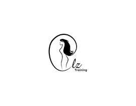
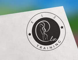
Design a Logo for a Fitness Business

  • Status: Closed
  • Prize: £25
  • Entries Received: 69
  • Winner: monishgoyani

Contest Brief

Design Brief:

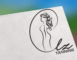
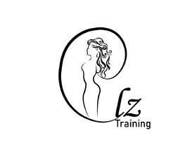
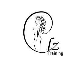
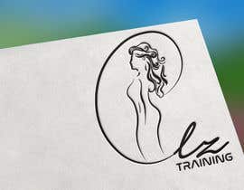
- business name 'elz Training'
- silhouette and hair to be the main feature (see attached)
- produce designs to capture the idea of circling the letter ‘e’ and following on with ‘elz Training’ at the bottom. (see attached)
- cartoon/pop art look & feel
- bold black outline of the image that flows into ‘elz Training’

Recommended Skills

Employer Feedback

“Absolute pleasure! Likely to work with again”

Profile image startsmarter, United Kingdom.

Top entries from this contest

View More Entries

Public Clarification Board

  • startsmarter
    Contest Holder
    • 5 years ago

    Just for clarity; we do NOT want it to look like a dress. we DO want them to look like legs. see new attachments.

    • 5 years ago
  • startsmarter
    Contest Holder
    • 5 years ago

    > So I really want to focus on #11 & just tweaking it slightly.
    CHANGES:
    > use the same face and hair of #44 & #49 and still creating the e from the end of the hair around the silhouette
    > change the bottom half of the silhouette where it’s just an outline of the legs rather than looking like a dress

    I hope this is clear. If not, do let me know! Thanks

    • 5 years ago
  • startsmarter
    Contest Holder
    • 5 years ago

    So far entry number #5 is how we envisaged the design. Could people take a lead on how this has been designed and produce more variations similar etc

    • 5 years ago
  • RehanTasleem
    RehanTasleem
    • 5 years ago

    #guaranteed

    • 5 years ago

How to get started with contests

  • Post your contest

    Post Your Contest Quick and easy

  • Get tons of entries

    Get Tons of Entries From around the world

  • Award the best entry

    Award the best entry Download the files - Easy!

Post a Contest Now or Join us Today!