Freelancer: Naumovski
Share:
Report Entry

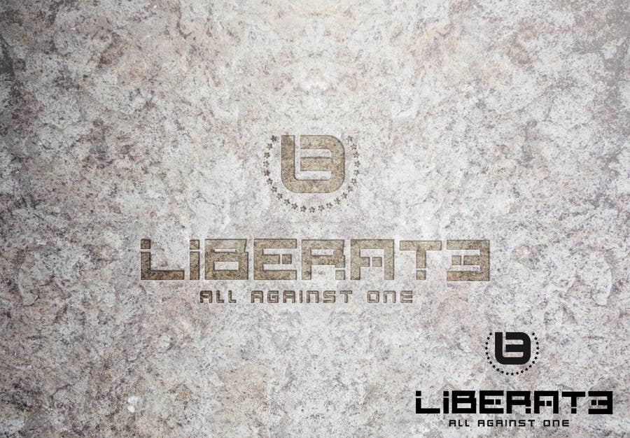
LOGO concept 02 [3 slides uploaded]

** Greetings! ** I am submitting my design for the contest. Design available in: >> fully editable layered .PSD + >> .JPG + >> .PDF + >> .EPS + >> .PNG with transparent background. All fonts used in the design will be delivered as well. Any feedback will be highly appreciated. Kind regards, **Naumovski**
Contest Entry #7 for                                                 DESIGN A LOGO TO BE USED IN A FEATURE FILM!

Public Clarification Board

  • Naumovski
    Naumovski
    • 8 years ago

    Hello. I didn`t use any references for the L+E combo. I was playing with the letters trying to come up with a unique symbol that is still connected in some way to the name "Liberate" and in stood up to me as an obvious choice. It looks clean with a nice squared look with roundish corners. Cheers!

    • 8 years ago
  • Atomik76
    Contest Holder
    • 8 years ago

    Hi - thanks you for your entry. Could you help explain why you used the first and last letters - the L + E? Did you have any examples that references the Chaos symbol?

    • 8 years ago
  • Naumovski
    Naumovski
    • 8 years ago

    The icon represents L+E (first and last letter from LIBERATE). All 3 elements: Icon / Liberate name / Tagline can stand alone for themselves. My regards!

    • 8 years ago