Graphic Design for Textile Manufacturer (Round 4)
- Status: Closed
- Prize: $100
- Entries Received: 113
- Winner: alexandracol

Contest Brief
We are a Branded Textile Manufacturer who exported to all over the world.
Recommended Skills
Employer Feedback
“@alexandracol won the contest on 1 March 2013”
![]() patterny, Hong Kong.
patterny, Hong Kong.
Public Clarification Board
-

biberse1192
- 11 years ago
hi how are u sir, i send u a privet msg please contact
- 11 years ago
-
biberse1192
- 11 years ago
#132 #133 #134
- 11 years ago
-

alexandracol
- 11 years ago
please check #130 #131 . thanks
- 11 years ago
-
biberse1192
- 11 years ago
#126 #127
- 11 years ago
-
biberse1192
- 11 years ago
hi , i send u privet msg plz check my nes entry #124 #125
- 11 years ago
-

numizan
- 11 years ago
Check it out my simple design, for 112, 113, 114, 115, 116, and 117, thanks for watching! seee you..... ^_^
- 11 years ago
-

Contest Holder - 11 years ago
Perhaps you should check your Private Message Box if there are messages from us
- 11 years ago
-

BuDesign
- 11 years ago
What do you mean? I got a message from you but don,t know what you mean. You don't answer....
- 11 years ago
-
biberse1192
- 11 years ago
please check my entry#87 #88 #89 #90 #91 #92#84 #85 #86
- 11 years ago
-
Contest Holder - 11 years ago
you must use our given source... pls check the private email too.
- 11 years ago
-

sultanakhan
- 11 years ago
Please check 94,93
- 11 years ago
-
Contest Holder - 11 years ago
both are too simple
- 11 years ago
-
biberse1192
- 11 years ago
#87 #88 #89 #90 #91 #92
- 11 years ago
-
Contest Holder - 11 years ago
Very good try!
- 11 years ago
-
biberse1192
- 11 years ago
HI, PLZ CHECK #84 #85 #86
- 11 years ago
-
Contest Holder - 11 years ago
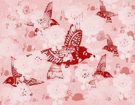
#41 with the cat on the rooff at night( the moon ) is a nice storied Art with beautiful color only its a bit too bright for night., also #44 and many others has horizontal lines to make the stripes look is not so free
- 11 years ago
-
alexandracol
- 11 years ago
I understand. I will improve my work. Thanks
- 11 years ago
-
alexandracol
- 11 years ago
please check #28 #29 #30 #31 . Thank you!
- 11 years ago
-
Contest Holder - 11 years ago
well done, hard working, your endurance is appreciated.
- 11 years ago
-
alexandracol
- 11 years ago
- 11 years ago
-
Contest Holder - 11 years ago
can be better in terms of colors...
- 11 years ago
-

alexandrupop550
- 11 years ago
Please check # 27 and give me feedback about the work please.
- 11 years ago
-
Contest Holder - 11 years ago
pls use our source mainly
- 11 years ago
-
alexandracol
- 11 years ago
- 11 years ago
-
Contest Holder - 11 years ago
the pattern is not good enough, a bit dull
- 11 years ago
-
alexandrupop550
- 11 years ago
Please check #9 and give me feedback about the work please.
- 11 years ago
-
Contest Holder - 11 years ago
quite good , how would the repeated pattern looks like ?
- 11 years ago
-
alexandracol
- 11 years ago
ok. I will return with another images.
- 11 years ago
-
Contest Holder - 11 years ago
#1 - #4 are nice pattern but rather simple. We are expecting a more like a Piece of Art / Painting as a unit to submit to us and we would repeat this unit to become a pattern. . . OR you may also make another one to show the repetition effect like you have done. But the graphic now is just good but not we anticipated type... understand ?
- 11 years ago
How to get started with contests
-

Post Your Contest Quick and easy
-

Get Tons of Entries From around the world
-

Award the best entry Download the files - Easy!