Freelancer:
daniasyrofi
Winner

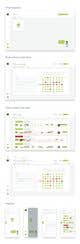
Redesign Header of a Webapp
Hi There. This is the Revision Redesign Header of a Web app. Please let me know your feedback. I would love to hear from you. Thank you. :)